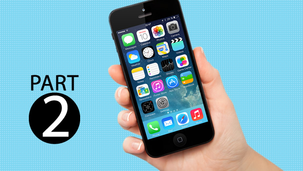
I have already covered the types of applications, fundamental human interface design principles and the iPhone OS environment in my first post of this series. In this article and the next, I will try to summarize the various components available for developing the user interface of your iPhone application.
Application Window: Each IPhone application contains an application window. It is at the top of the application hierarchy. Every other control resides within the application window.
Views: Provides content regions. There are different types of views available like tableview, textview, webview. Each view has a distinct set of functionality. An application window contains more than one view.
Controls: These are graphics object with which a user can interact with. A view can contain multiple controls. There are some controls which belong to specific view only (e.g. disclosure indicator in table view) while some controls can be used in variety of views.
Screen: It is a logical entity whose instance you cannot create programmatically like a window, view or control. You can visualize it as a state in your application. Each screen contains combination of views and controls.
Using views and controls in application screen:
Each view and control provides some level of customization at look and behavior level. Always try to use standard views and controls with their default look and behavior as user is familiar with it, except in the case of immersive application type. In an immersive application you can create customize controls to form a unique environment and discovering that environment is a part of user experience.
Bars:
Bars are views that are placed either at the top or bottom of the screen. They have defined appearance and behavior.
- Status Bar: It appears at the top of screen. It gives device and carrier specific information to user like signal strength, carrier name, battery charge, current network connection. You can customize its appearance and to some extent its behavior. You can hide the status bar (may be in immersive application) but you should seriously consider this design decision as user expects it to be always available.
- Navigation Bar: It appears just below the status bar. It displays the title of the current view, controls to act on current view and navigational controls. Navigation bars are specifically used in productive applications as they arrange information in a hierarchy.
- Toolbar: It appears at the bottom edge of the screen. It contains buttons to manage the current context/view. It should not be used to switch between different modes or tasks of an application. It can contain five buttons with each having 44*44 hit area.
- Tab Bar: It appears at the bottom edge of the screen. It is used to mange tasks or modes in an application. Each tab bar contains tabs having image and text. In case there are more than five tabs, iPhone OS displays four of them with additional “More” tab. Tapping the more tab displays additional tabs available in a separate screen. It can contain edit button to configure tab bar to display most often used tabs. Each tab can contain a badge to give additional information to user in a nonintrusive way.
Modal Views:
They are analogous to alerts in JavaScript i.e. unless you dismiss them you cannot move forward. They are normally used to give some critical information to user which user is not expecting or additional choices or functionality to be offered. But it is important to avoid overusing them as they break the normal flow of user.
- Alert: Give important information to user which may affect their use of the application. Its timing of arrival is unexpected. It contains text and buttons. It should have maximum to buttons.
- Action Sheet: Give additional choices to user corresponding to current action. It always opens from the bottom of the screen and hovers over current view. It displays multiple buttons from which user selects appropriate one. It normally contains more than two buttons.
- Modal Views: Provide extensive functionality corresponding to current task. It always opens from the bottom of the screen and covers entire view. It displays combination of controls and accepts multiple user inputs.
I would soon be posting the concluding part of this series, so stay tuned.


