
You’ll wonder why this topic now. Responsive eLearning has been around for at least a couple of years now and everyone should be pretty much clear about what it is. I thought so too, till I saw some examples on different websites being passed as responsive eLearning while they were clearly not.
So, what do we mean by Responsive eLearning?
Responsive eLearning is eLearning designed and build in a way that it works well on all sorts of devices by responding to the screen size of the device on that it is being viewed. It does so through user agents and media queries. Critical to note is that the idea of responsive eLearning is to ensure that the content is presented in the most user friendly way on all target devices. To achieve that, the content needs to be restructured and laid out differently on the screen.
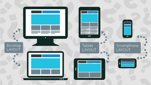
Here’s an example
As you can notice the layout changes completely, navigation panel is modified and placed at different location, image size, representation is different (and scaled appropriately), and text is readable on all devices.
And what is not Responsive eLearning?
Some eLearning developers are publishing Flash eLearning as videos (so that it works on iPads and mobile devices) and make it scale to device size. So, on smaller phones it does ‘work’ (technically i.e.) but can the learner really see or read anything in that video on a small device? I doubt.
Some eLearning authoring tools make the navigation responsive while the course is not. So when you view a course on a smaller device the navigation readjusts to screen size but the course simply scales down.
These are definitely not responsive eLearning and you should stay away from it. When looking for responsive eLearning, just remember scaling is not responsive.
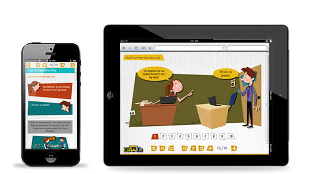
A quick word on Videos
While I do agree videos are naturally responsive and we can use them as responsive eLearning medium. However, for that you need to shoot/create the videos appropriately keeping in mind their usability, even when it scales down on smaller devices. This video is a good example of one created to play on all devices.