
According to ISO 9241, Usability is defined as the extent to which a product (a software, a coffee maker etc.) can be used by specified users to achieve specified goals with effectiveness, efficiency, and satisfaction in a specified context of use. In the context of learning, usability is the ease with which your users interact, access and experience the course. It includes everything your users see, hear and do; the rationale behind their actions; and their emotional reactions to the results.
Ensuring high usability is a challenge in eLearning course development. For a multi-device course even more so as you need to account for a wide range of devices and the user behaviour for each. With desktops and laptops, there is an abstract layer of mouse and keypad, whereas with touch-based mobile devices, we use our fingers in different ways to achieve different results.
There are many Common Misconceptions About User Experience Design. In light of these misconceptions and characteristics of multi-device/responsive courses, below are some questions that you need to ask yourself to ensure a good User Experience across a variety of devices:
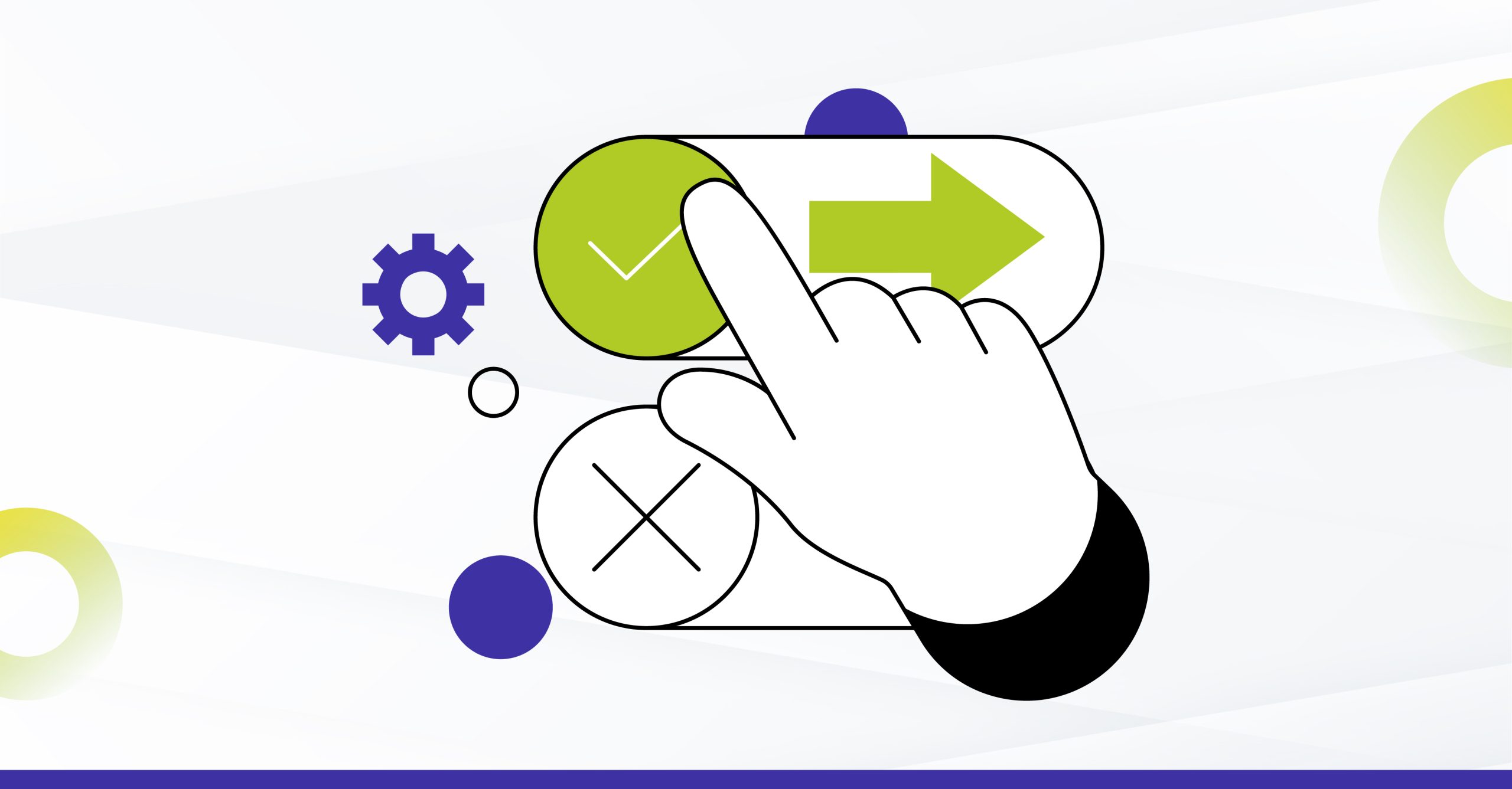
1. Are you leveraging the power of ‘touch’?
Of the many affordances that tablets and smartphones offer, one of the important ones is response to ‘touch’. So while leveraging the ‘touch’ capability, it is important to ensure that the interactive elements are both large enough and far enough apart to be comfortably selected.
With touch devices, there also arises the possibility for gestural navigation. So, in addition to providing buttons, it is essential to code for a swipe gesture on tablets and smartphones.
2. Is it easy to navigate through the course?
As the device sizes reduce, we also have to decide on how to handle the global navigation. Since all navigation controls aren’t required for smaller devices, it is advisable to implement a responsive menu where controls get grouped and positioned based on the device size. Hence, controls are hidden or displayed based on device or OS. For example, most of us are used to using our tablet’s or phone’s audio controls, so audio controls need not be included in the menu on mobile phones and tablets.
3. Is the text readable?
Text size varies based on device resolution – the higher the resolution, the smaller the text. A solution here can be to use a relative sizing unit like “em” to dynamically set font size and line spacing for optimal readability across devices.
The “em” takes its size relative to its parent unit. So assuming the browser to be the overall parent, we can set 1 em to be equal to the browser’s default font size – which in most cases is 16 px. From there on, depending on how you structure your page, you can set relative font sizes in “ems” for texts in different containers.
More on font sizes, types and icon fonts detailed in Design Challenges and Considerations for Responsive eLearning
4. Is there consistency in representation?
Since a multi-device/ responsive course will be accessed from desktops, tablets and smartphones, consistency in representation is of prime importance. While designing, keep the key elements (navigation, interactive elements etc.) consistent in their appearance and position so that navigating the screen is as intuitive as possible.
Also, use the same design, fonts as well as the page layout consistently over the whole eLearning course.
5. Is there clarity in learner instructions?
Multi-device content is most likely to be displayed on both, touch and non-touch devices. In such scenarios, instructions play a crucial role. When writing the action-specific instructions we can either have conditional device-specific instructions, i.e. ‘Click OK to proceed’ for desktops/laptops and ‘Tap OK to proceed’ for touch screen devices. The other option is to keep action-specific instructions generic, i.e. ‘Select OK to proceed’, for all devices. Task-based instructions, on the other hand, being task specific have to be self explanatory, i.e. ‘Go through each example to know how to ensure data security’.
6. Is there clarity and consistency in element labels?
Shifted labels can be a major setback in multi-device learning where content layout changes based on device dimensions. It’s important to check that the same meaning has been retained across all devices and layouts. We need to ensure that the labels point to the corresponding elements, and also that the sequence of appearance (i.e. visual preceding the text/ following it) is maintained throughout.
7. Do the interactive elements look clickable or touchable?
This is all the more important on touch-based devices; since these do not support hover effects, you need to design in such a way that users can easily recognise where interactivities are available.
8. Does the design degrade gracefully or enhance progressively?
With so many phones, operating systems, screen sizes, interface capabilities, sensors, etc., along with multiple platforms and significant variance of hardware and software features, the trick is to design in such a way that the content can support ‘Progressive enhancement’ (Mobile first approach) or ‘Graceful degradation'(Desktop first approach). Images for instance can be designed based on the fundamentals of fluid layout, wherein images can be tiled or stretched depending on the orientation of the device.
9. Does the course allow accessibility?
Ensuring an optimal user experience for people with disabilities, including people with age-related impairments, so that they can perceive, understand, navigate, and interact with the course and contribute equally without barriers, is an important part of usability design. By utilizing the device specific accessibility features, we can help them improve their learning experience.
10. Has the course been optimized for UX?
Considering that the bandwidth on mobile devices is usually not the same as desktops, it is important to ensure that graphics and all elements used in the course are optimized. This reduces the loading time, improves performance thereby impacting the overall experience.
In case the scene is heavy and would take more time than usual to load, it is important to set the expectation right by allowing for ‘Time-outs’.
User Experience design is not the role of one person or department. Varied cross-functional teams are required to design and develop a quality learning experience. It’s unrealistic to expect Instructional Designers to take ownership of the learning experience. While, we agree that they do drive the design of the experience. The actual design and creation is still left to the development team; creating good user experiences is about teamwork, cross functional competence, and a clear vision of the learner experience sought to be delivered.