
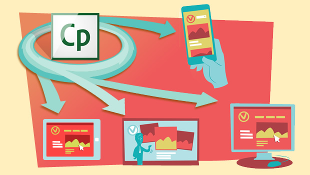
Version 8 of Captivate (CP8) has a whole new set of features like gesture-enabled mobile learning, geo-location support, MinMax object sizing, and many more.
From a developer’s perspective, the user-friendly interface and multi-device authoring canvas certainly makes it easy to create a responsive course. Additionally, CP8 comes with an extensive library of development-ready assets that can be immediately incorporated into the content. You can also import HTML5 and Edge animations and embed them directly into the pages.
For us, the most interesting of these new features is the capability to develop responsive eLearning.
We have been working with this tool and based on our experience so far here are some of the features, capabilities, and constraints specifically for creating ‘Responsive’ elearning.
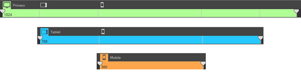
Breakpoints
In Captivate, responsive courses have three breakpoints:
- Primary
- Tablet
- Mobile
These breakpoints indicate the starting point of a view. The width between two breakpoints has a common screen design. For instance, if the width of your learner’s device is 800 pixels, (s)he will see the content designed for the Primary view. In case the learner’s device has a width of 600 pixels, (s)he will see the content designed for tablet view.
To ensure optimal performance, we suggest using only the default templates available in Captivate 8 that are supported for responsive output. Captivate currently has 24 interactive and non-interactive templates.
What can be done:
- Only three specific breakpoints can be set.
These breakpoints can be modified as per specific devices. For example, a breakpoint set to work for an iPad will not display the screen layout as intended for a comparable Android device. Similarly, if the breakpoint is set for an Android 10″ tablet, it will not display properly on an iPad device. It is recommended that you get clarity on the set of devices that your target audience will be using so that appropriate breakpoints could be set - Positions of objects can be reordered as per the pre-determined layout (also referred to as the ‘viewport’ in the application)
- You can choose to retain the same layout across different devices by using relative positioning of objects, or you can switch to a new layout or template with each change of break point
Desktop [Resolution 1024*627]
Tablet [Resolution 768 * 627]
Smartphone [Resolution 360*480] 
What cannot be done:
- Layout for viewports that fall between pre-set breakpoints cannot be controlled. For example, if the preset breakpoint widths are 1024 (primary), 768 (tablet) and 360 (phone), then output on a device that has a viewport width of 962 cannot be controlled. It will auto-resize and may not display correctly or may even be misaligned
Note: While designing, it is very important to maintain the aspect ratio so that scaling / rearrangement of the content happens proportionately. To maintain aspect ratio of the objects, select Auto for either width or height of the object in the Primary view
Playbar
The default mobile playbar in responsive projects has a height of 45 pixels.
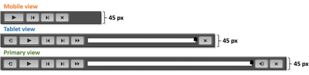
So while designing, do make sure to deduct the pixels from viewport height that will be occupied by the playbar.
What can be done:
- Button customization: We can customize the button face color, background color, button icon color and button glow color
- Hiding navigation controls: We can hide the playbar controls buttons
What cannot be done:
- Slider: On an iPad, the slider cannot be dragged. Instead, it functions only as a visual indicator of course progress
- Player UI design: Playbar controller design can’t be modified for responsive such as button size, shape, height and width
- Button states: States such as rollover, visited, clicked, etc. cannot be added
- Disabling buttons: The Back button on the first screen and Next button on the last screen cannot be disabled
- Adding Global functionality: Global functions, such as Resources and Glossary, cannot be added to the UI without extensive customization. A possible workaround is to add these as buttons at a slidelevel
Fonts and Text Formatting
With Captivate, the text font size gets adjusted to fit the text in Primary, Tablet, and Mobile views. One option could be to use ‘Auto’ or ‘% relative’ however, we did experience the text being scaled down for views that are in-between the breakpoints.
Also, it is recommended to use Web safe font for Responsive projects.
What can be done:
- Text can be formatted for style such as bold, italic, and underline and colors can be changed
- Text can be hyperlinked to a Web URL or a downloadable document
What cannot be done:
- Font embedding is not supported. Captivate 8 output only shows the system default fonts (Arial and Times New Roman) even if other fonts are used during creation. Text that needs to be rendered using a specific font for brand identity will need to be converted to an image
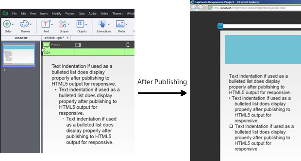
- Text indentation if used as a bulleted list does display properly after publishing to HTML5 output for responsive
Captivate Buttons
There are two button types available—the default Captivate 8 buttons (also known as the interaction buttons) and the custom buttons that can be created using shapes.
Available default Captivate Interaction buttons:
- Text button
- Transparent button
- Image button
Custom Buttons
The custom buttons can be:
- Programmed to be set globally instead of per slide
- Modified to include gradient fill and solid fill with a common state
- Set with different properties for three breakpoints
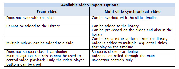
Audio/Video Formats
Captivate 8 supports files in the following formats:
- Video: AVI, MOV, FLV,F4V,3GP, MPEG
- Audio: Add *.mp3 and *.wav audio files
What cannot be done (video):
- Change or hide the default controller/video player
- Manage auto play function for different devices (if auto play is selected for the primary device, then the same will also be applicable to the tablet and phone devices)
Quiz
In addition to using the Captivate 8 default quiz templates, videos, images and shapes can also be added to the following question templates:
- Multiple Choice
- True/False
- Fill-In-The-Blank
- Short Answer
- Matching
- Hot Spot
- Sequence
What can be done:
The result page look and feel can be modified and can include feedback with score.
What cannot be done:
- Modify or change the functionality for the above question templates
- Add extra buttons in question templates
- Add other customizations
- Add variable scoring
- Use the reattempt option, the course has to be refreshed in order to reattempt
Publishing and Device Support
Captivate 8 responsive publishes to HTML5 output only. The unsupported features of HTML5 publishing also apply to responsive projects.
In terms of compliance, it can be published for SCORM 1.2, SCORM 2004, AICC, and TinCan.
You can preview the output using any browser that supports HTML5. The output can also be previewed using Adobe EDGE Inspect which will allow you to experience exactly how the course will look and work/function on actual devices, from a user’s viewpoint.
Once you upload the package onto an LMS, the right resolution version will be delivered depending on the device through which the user is accessing the course
HTML5 is not supported on all operating systems and browsers. Given below are the OS and browsers that support HTML5:
Windows:
- Internet Explorer versions 9, 10 and 11
- Chrome 34 (or later)
MAC:
- Safari 7.0.3 (or later)
- Chrome 34 (or later)
IOS 7 (or later):
- Safari (latest)
Android 4.2.2 (or later):
- Chrome (latest)
Edge Inspect:
- Chrome 34 (or later)
Note that Captivate 8 allows you to import files from Captivate 7 to Captivate 8, however, it will not necessarily be responsive as it opens the files in standard mode and not responsive mode. To deal with this, you will need to design the course afresh if you are targeting responsive.Conclusion
Overall, we found Captivate 8 to be efficient for creating courses where the breakpoints are limited.
However, if your organization has adopted a BYOD policy, there would probably be a wide range of devices with different browser and OS combinations. Here, you may face some issues, like text scaling, overlapping or content being misaligned on Android/BB devices, and also on devices whose size/resolution falls between or beyond the preset breakpoints.
While we continue working with Captivate 8, these are our initial impressions.
We are keen to read your feedback about the new responsive features that this tool offers and also the new interface, especially if you were able to overcome any similar issues faced. Do add your comments below.