Learning solutions are increasingly extending to and being primarily designed for delivery on mobile devices. This has caused mobile accessibility to become a focus area for designers and developers of eLearning.
We recently came across a talk by Marcy Sutton, Accessibility Engineer at Adobe, where she raises some interesting points about how to “win” at mobile accessibility.
While the talk was about website and mobile web app accessibility, there were definitely considerations and tips that we felt would apply equally well to eLearning design and development. Here’s a quick summary.
-
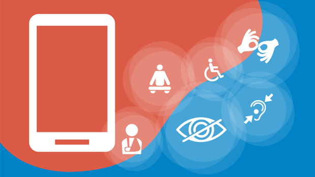
- First, a quick look at types of disability and the accessibility support they require. Those with no/low/impaired vision require zoom features, the ability to control contrast, and screen readers. Those with hearing disabilities require captions and transcripts. Those with motor or physical disabilities may need to use keyboards or other assistive technologies and devices. There are also those with cognitive or learning disabilities. While this is a newer space, from an eLearning viewpoint, this is a space where approach, structure, writing, and visual design can play important parts in making content more accessible.
- One of the most interesting points was about how to perceive disability. Marcy referred to the Microsoft Inclusive Design Toolkit which describes how disability can be something permanent (e.g. a missing arm), temporary (e.g. a fractured arm), or even situational (e.g. being a new parent and having to do many tasks with a single arm while holding a baby in the other). Looking at disability in these ways can also make us realize how accessibility does or could apply to each and every one of us.
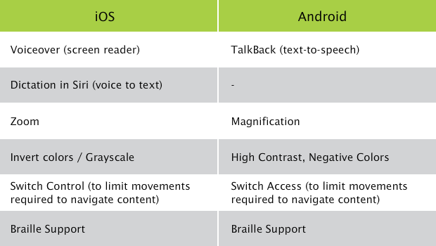
- When it comes to accessibility support, iOS emerges as a clear winner over Android. That said, both platforms do have useful features:
- Here are some ways to overcome common barriers to effective accessibility on mobile devices:
- Avoid locking down the zoom feature. Keep the pinch and zoom option enabled, so that users can increase the font size on the page/in the app itself, rather than having to go to the OS settings.
- Avoid scrolljacking. Inconsistent scroll behavior can be confusing.
- Avoid visual clutter and keep the layout neat and organized.
- Ensure that icons have text labels to avoid ambiguity.
- Use buttons or other controls (rather than gestures) for content navigation to avoid conflicts with gestures required for screen reader operation.
- As designers and developers, we need to focus on what is within our control. Some of the suggestions mentioned included:
- Use HTML buttons and other semantic elements with built-in accessibility, rather than divs, since the latter are not recognized by screen readers.
- Use the “aria-label” attribute for elements without text labels.
- Make sure touch targets are large and have sufficient space between them.
- Use “aria-hidden” for specific regions (for example, content behind a modal dialog box) and set “tabindex = “-1″” for any interactive elements within that region that are part of the tab order. This will ensure they get skipped by the screen reader when they are background or visually hidden elements.
- While there are tools that exist for testing accessibility on desktops, there are currently no tools designed specifically for mobile accessibility testing. By tethering a mobile device to a Mac, you can use the iOS Safari Accessibility Node Inspector for mobile content; however, you cannot run any accessibility audit. On a Windows computer/laptop, you can load mobile content into the Firefox browser, resize the browser window to a smaller size, and use the Firefox Developer Tools aXe extension to run an accessibility audit on the content. However, neither of these options tests accessibility on the actual mobile device. With the Chrome browser, you can tether an Android device and use the Chrome Accessibility Developer Tools to run Chrome Device Inspect against the actual mobile device content. The drawback here is that Chrome is not widely used for accessibility.
- Some potentially useful resources mentioned during this talk included:
- The BBC Mobile Accessibility Guidelines
- The WebAIM site
- The Microsoft Inclusive Design Toolkit
- The Simply Accessible site (when viewed on mobile devices)
- The A11Y Project (a11y is a numeronym for accessibility)