
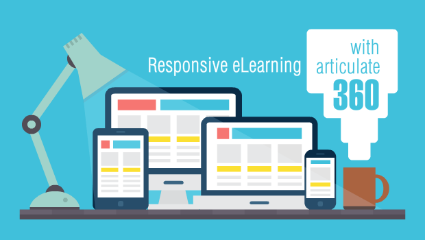
Last week folks at Articulate released a new version called Articulate 360, which packs several tools and resources, including one of the most popular elearning authoring tools, Storyline, in its latest avatar as Storyline 360.
This video review from Tim Slade captures the most important new features:
The above video highlights the following key new features:
- Ability to insert various slide types
- New content library of assets
- A new object called ‘dial’
- Ease in managing motion paths
- New trigger events
We at Upside Learning have been reviewing the various responsive elearning tools out there in the market (this is the last post in the series with the link to our other review posts) and therefore were looking forward to a Storyline version that helps responsive elearning development. Here are our initial reactions.
Storyline 360 has a responsive player, which squeezes the content to fit to a smaller screen, just like a video player. Take a look at the screenshot taken from Storyline website that depicts how content would be rendered on different devices via the responsive player.

I don’t find this to be an ideal solution as the text or interactive buttons would get squeezed to a very small size, thus making them unreadable or difficult to use. To be able to work with a responsive player, it would be best to design Mobile First and let the player handle it for larger devices, but this actually will not look well designed in my view.
I think folks at Articulate too realized that this would not be a good enough solution especially when you have loads of tools out there providing real responsive capabilities. So they added a new tool to the mix – Rise. In its description they say
“Effortless responsive authoring
Create fully responsive courses that adapt automatically to any computer, tablet, or smartphone, without any manual tweaking”
That sounds promising and exciting!
Rise has templates that you can choose from or work with blocks (image, multimedia, interactions) and create screens you want. It looks similar to what Adapt or Evolve do.
We are trying out Rise to compare if it is any better. Watch this space.